Checkout Isn't a Form. It's the Only Part of the App Where Architecture Has a Stopwatch on It
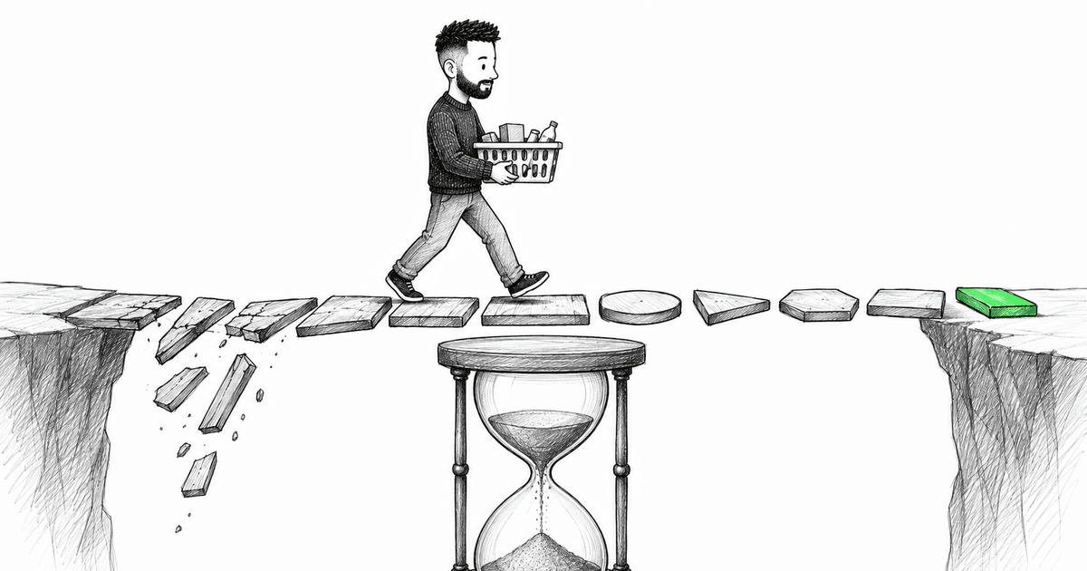
I've spent a real chunk of my career around purchase flows — one-click purchase, multi-step checkout, the whole family of screens between "I want this" and "I bought this." And the thing that took me the longest to internalize wasn't a pattern or a library. It was what we're actually selling in that flow.
It isn't the UI. It isn't even the product, at that point — the user already decided on the product two screens ago. What we're selling is time-to-goal. How fast, with how little friction, does this person get from "I'm ready to buy" to "it's done"? Every metric that actually matters downstream — conversion, cart abandonment, repeat purchases — is a proxy for that one number.
The product in a checkout flow isn't the form. It's the distance between intent and confirmation.
This sounds like a UX statement, and it is one. But I want to argue it's also, maybe primarily, an architecture statement — because the UX-y stuff people file under "polish" (responsiveness, one-click purchase, graceful recovery from a dropped connection) is downstream of decisions made in how the checkout is built, not decisions made in Figma.
Every step is round-trip debt
Here's the mental model I use. Every screen, every confirmation, every "are you sure" in a checkout flow is a withdrawal against the user's patience. Doesn't matter how pretty it is. A step is a step.
Multi-step checkouts get justified all the time — shipping, then payment, then review — and sometimes that's genuinely the right shape. But I'd push back on treating that as free. Each transition is a network round trip if it's fetching anything, a re-render if it isn't, and either way it's a moment where the user can get pulled away, get a spinner they don't trust, or hit the back button and lose state they already entered.
The architectural question isn't "how do we make step 2 nice." It's "does step 2 need to exist as a separate step at all, or is it three fields we could've asked for on step 1 without anyone noticing the difference." That's a product conversation, sure, but it's the frontend architect's job to keep asking it, because engineers are the ones who feel the cost of not asking it — in state management, in the number of places cart data can go stale, in every edge case around "what if they refresh here."
One-click purchase is a state-management problem wearing a UX costume
One-click purchase looks, from a design brief, like "remove the button presses." Architecturally, it's a much harder problem: you're compressing an entire multi-step flow's worth of validation, payment, and inventory checks into a single optimistic action, and you have to do it without ever showing the user a screen that says "wait."
That means the hard part isn't the click. It's everything that has to already be true before the click for the click to be safe:
interface OneClickEligibility {
  hasValidPaymentMethod: boolean;
  hasCompleteShippingAddress: boolean;
  itemInStock: boolean;
  priceUnchangedSinceLastSync: boolean;
}

function canOneClickPurchase(state: OneClickEligibility): boolean {
  return (
    state.hasValidPaymentMethod &&
    state.hasCompleteShippingAddress &&
    state.itemInStock &&
    state.priceUnchangedSinceLastSync
  );
}
Everything hinges on that check being current at the moment of the click, not current as of when the page loaded. If price or stock data is stale by even a few seconds, "one click" turns into "one click, then a screen apologizing that the price changed" — which is worse than a normal checkout, because you promised speed and delivered a rug-pull.
So the real architectural commitment behind one-click purchase isn't a button component. It's a decision to keep a small slice of critical state (price, stock, payment validity) continuously fresh in the background, so the click can be trusted the instant it happens. That's a background-sync and cache-invalidation problem, not a UI problem, and it needs to be treated as first-class — not bolted on after the button ships.
Optimistic UI, but with a real rollback story
Checkout is one of the few places where optimistic UI actually earns its complexity, because the alternative — making someone stare at a spinner while you confirm a card charge — is its own kind of failure. But optimistic UI without a serious rollback path is just a faster way to lie to the user.
function useSubmitOrder() {
  const [status, setStatus] = useState<'idle' | 'confirming' | 'error'>('idle');

  const submitOrder = async (order: OrderDraft) => {
    setStatus('confirming'); // show success-leaning state immediately

    try {
      const confirmed = await placeOrder(order);
      return confirmed;
    } catch (error) {
      setStatus('error');
      // the user already saw a hopeful state — the recovery message
      // has to explain what changed, not just that something failed
      throw error;
    }
  };

  return { status, submitOrder };
}
The detail that actually matters here is the comment. If you show a confident "confirming your order" state and then it fails, the failure message can't be a generic toast. The user's mental model has already moved forward — they think they're done. Rolling that back cleanly, with a message that says what actually happened (card declined vs. item went out of stock vs. network timeout), is architecture work: it means your error states need to carry why, not just that, all the way from the API layer up.
Responsiveness is a checkout feature, not a checkout nice-to-have
I'd draw a hard line here: on most of an app, a layout that reflows awkwardly on a weird viewport is a bug you triage next sprint. On checkout, it's a lost sale, because a meaningful chunk of purchases happen one-handed, on a phone, possibly in a moving vehicle, possibly with one bar of signal.
That changes the priority order of what you architect for. Payment fields need to work with autofill without fighting the browser. Buttons need to be large enough that a shaky hand doesn't mis-tap into "cancel." And the layout needs to survive the keyboard eating half the screen on mobile, because "the confirm button is off-screen when the keyboard is open" is a shockingly common way to lose an order that was otherwise complete.
None of that is exotic. It's just a different priority order than the rest of the app gets, and if your component architecture treats checkout screens as "just more pages," they'll get the same generic responsive treatment as everything else — which is to say, good enough for a blog post, not good enough for a payment form.
The metric that should be driving these decisions
Here's the part I actually want to land, because it's the thing that reframes all of the above from "best practices" into an actual measurement problem.
If the product is time-to-goal, then the thing worth instrumenting isn't page views or even conversion rate in isolation — it's the distribution of time between "entered checkout" and "confirmed order," broken down by step, and the drop-off at each step. That's a genuinely different question than "does this page load fast," and it points architecture in a specific direction: every step needs a timestamp, every abandonment needs a last-known-step, and every retry needs to be attributable to a cause (validation error, payment decline, network failure, user just left).
function trackCheckoutStep(step: CheckoutStep, elapsedMs: number, outcome: 'advanced' | 'abandoned' | 'errored') {
  analytics.track('checkout_step', { step, elapsedMs, outcome });
}
That's a small function. The architectural commitment behind it — instrumenting every step consistently, from the same source of truth as the state machine driving the flow, not bolted on separately by whoever remembers to add tracking — is the actual work. Get that right and you have a real answer to "where is friction actually happening," instead of a guess dressed up as a redesign.
Where this leaves the architecture conversation
None of this is about picking the right library for multi-step forms. It's about recognizing that checkout is the one part of the app where the business metric (completed purchase) and the architecture metric (time-to-goal, state consistency across steps, recovery from failure) are the same number wearing two names. Everywhere else in the app, you can separate "is this well-architected" from "does this convert." In checkout, you mostly can't — a badly architected checkout is a checkout with worse conversion, because every extra round trip, every stale price, every optimistic update with no honest rollback is friction the user feels as delay between wanting the thing and having it.
If you're the one arguing for a cleaner checkout architecture and getting pushback that it's "just implementation detail" — it isn't. I'd make the case that of everything in the app, this is the part where the architecture review and the conversion review should be the same meeting.
I've got a lot more from this part of my career than fits in one article — one-click purchase edge cases, retry strategies for flaky payment providers, the exact way stale cart state causes support tickets. If there's a piece of this you want me to go deeper on, tell me which one and I'll write it.
About the author
Maksym Kuzmitskyi is a Senior Software Developer focused on React and TypeScript. His work includes enterprise applications, shared frontend components, Node.js integration, testing and accessibility. Alongside frontend work, he designs AI-assisted delivery workflows and has developed personal review tooling.
More than a blog post
I share frontend news and the reasoning behind it throughout the day. Pick the language that feels natural to you.